Case Study
Bend Janitorial
Website, Rebrand, Logo
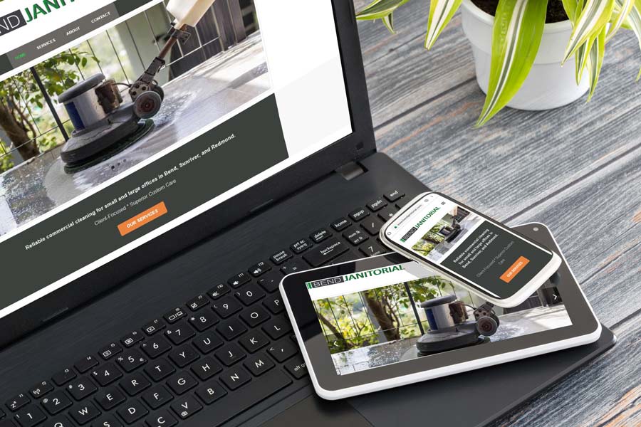
The owner of Bend Janitorial wanted a website and rebrand for his company:
- Fullly responsive, 4-page website
- Company logo
- Refresh of company colors
- New business cards
We met together and talked about company history, mission, vision, values, and future plans. We also discussed concepts for the logo and goals for the project.
During and after the meeting I made a list of qualities that exemplified the company. The ones that rose to the top became the starting point for the rebrand.
Trust
Dependability
Work Ethic
Superior Customer Care
Branding: Colors and Concepts
The brand colors needed an update, fresh shades with more contrast. Given the company’s industry, I wanted the mood to feel crisp and clean. The use of white is for more than just adding a neutral-it’s an integral part of the color scheme. The high contrast between the dark grey and white supports the company’s mission.
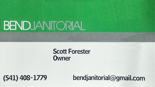
Previous business card

New card, colors, and logo

Logo and social sharing icon
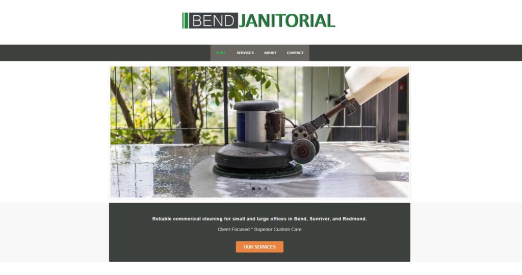
Scott’s website showcases his company’s exceptional service and customer care.

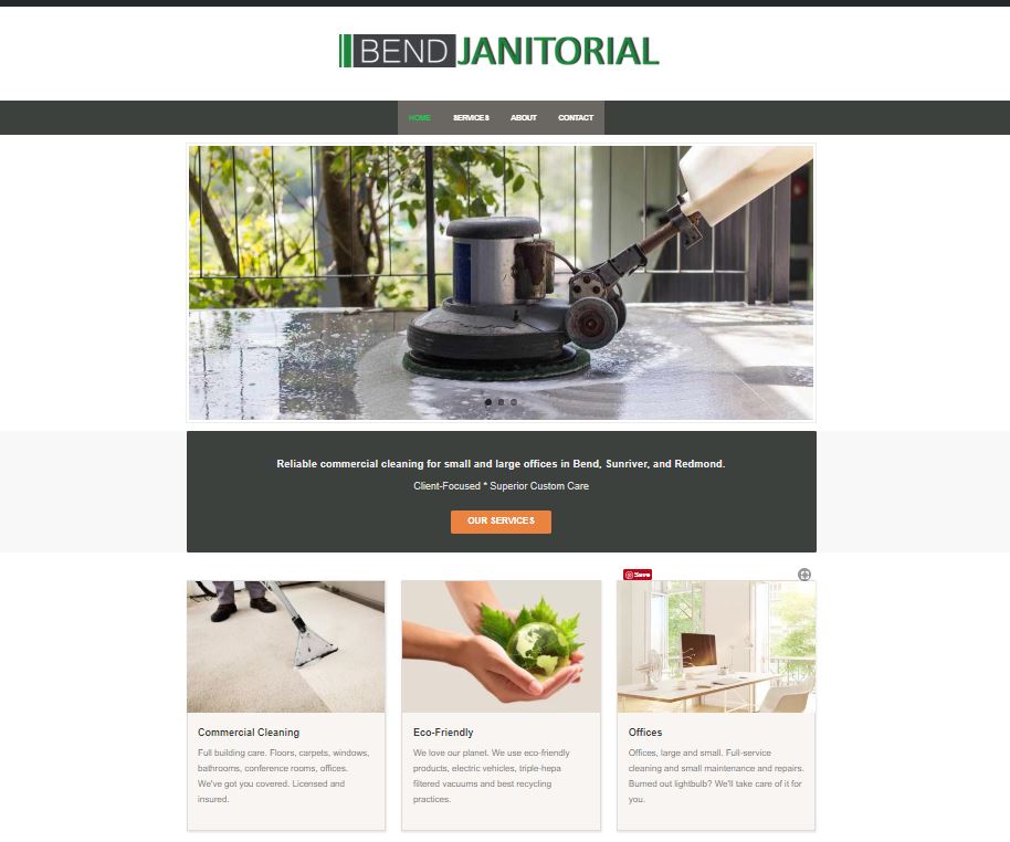
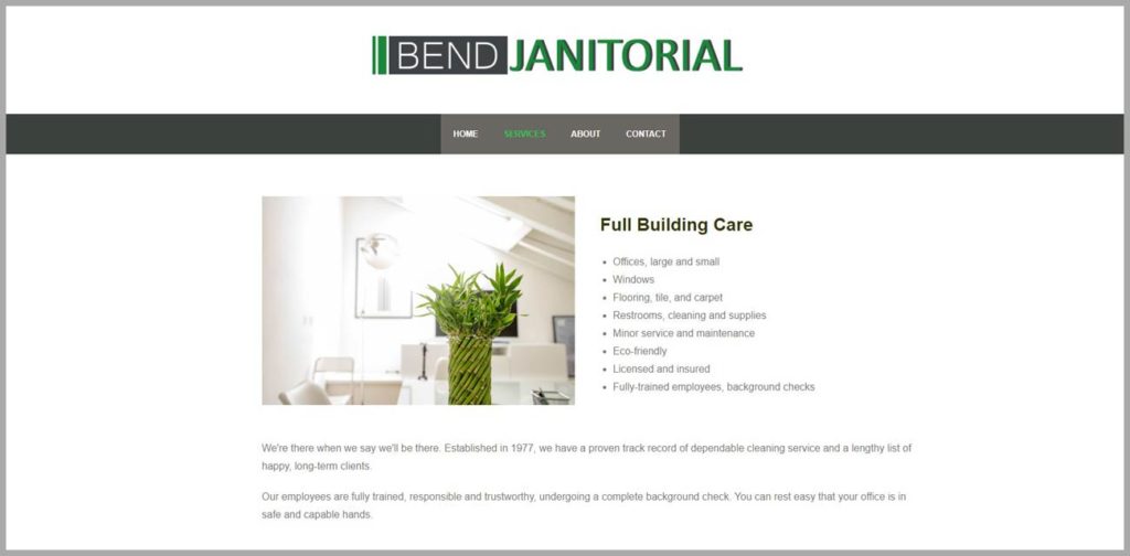
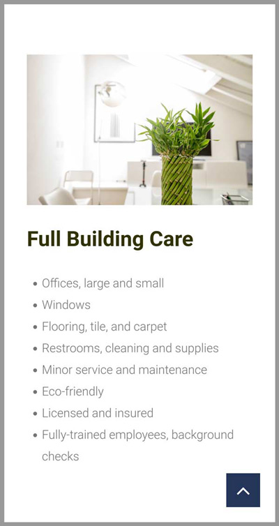
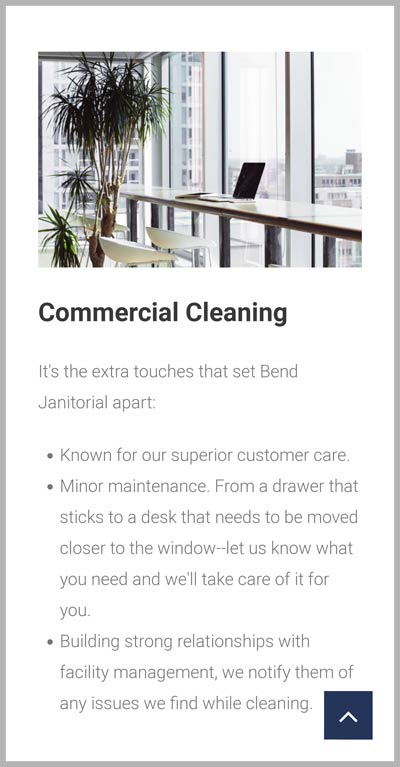
Clean web design with a lot of white space reinforces his brand’s reputation for superior cleaning services, trustworthiness, and professionalism.

Thank you so very much for the fantastic website. It was a blast working with you and getting this done and online. I was in the dark going into this on how websites are created and you guided me the whole way. We worked really well together as a team and I’m very satisfied with the outcome.
I appreciate everything you have done, but what I really appreciate are the little things since. The “Hey, I have a huge opportunity and I need a new page up on my site–Can you help?” and two hours later you had it up and doing what I needed it to. That was awesome!
The site traffic info and tips on how to increase it make me feel that much better about my choice to work with you. Thank you, Penny, you rock!
-S.F., Bend Janitorial
